STIMULATING THE BRAINARY EXPERIENCE
The Brainary is an Australian EdTech provider specialising in STEM education, robotics and assistive technology whose main clients are educators, librarians and therapists.
I was part of a project tasked to assess the usability of the website and provide research-backed solutions to increase sales conversions.
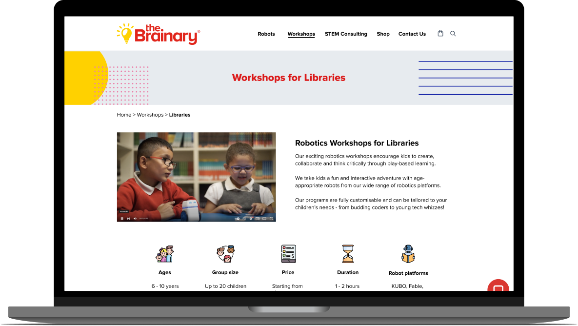
Final prototype mockup: Workshops menu
Final prototype mockup: Product page - Robotics workshops for schools


PROJECT OVERVIEW
THE CHALLENGE
The Brainary wanted to reduce website bounce rates and increase sales conversions by understanding their customers and how to communicate their products effectively. Their business vision is to grow their STEM education services while maintaining product sales.
THE PROBLEM
Educators need a way of finding relevant information on the website so they can organise STEM programs and workshops.
THE SOLUTION
We redesigned the information architecture and the content and copy of key product pages for The Brainary, improving ease of navigation and information findability.
THE RESULT
Our information architecture redesign was validated by an 80% time saving in navigating a page search on the website. Users also liked the look and feel of the new product pages, and said the information was easy to read.
PROJECT ROLES AND RESOURCES


Team
4 UX designers
Timeline
3-week sprint


Roles
Research, UX/UI, copywriting, prototyping, usability testing
Tools
Figma, Miro,
UX Metrics
AN UNDERPERFORMING WEBSITE
In February 2022, The Brainary relaunched their website to integrate the existing e-commerce shop and their STEM and robotics services. Since the relaunch, however, shop sales has dropped, bounce rates are high and enquiries through the website’s contact form have been negligible.
The Brainary reached out to us for help creating a seamless user experience and improving their website’s business performance by understanding their customers and how to communicate their products and services effectively.

KICKOFF
STARTING WITH RESEARCH
At the outset, our main research goals were to understand:
The Brainary’s current user experience
STEM education initiatives in public schools and libraries
Users’ behaviours and needs

LEARNINGS FROM THE CURRENT DIGITAL EXPERIENCE
Significant navigational and UI issues were driving the website’s high bounce rates and low retention. We validated these test findings against Google Analytics data.
Website Usability Test

Results and observations:
4/5 users spent more than 2 minutes trying to locate the workshops page.
User behaviours revealed systemic pain points in the information architecture, including:
Searching in the wrong menu categories
Not understanding menu labels e.g. Professional Services and Development
Obscure secondary or local navigation
Google Analytics Corroborated Test Findings

The Brainary’s weekly emails and quarterly newsletters typically drive website traffic up 50%-100%.

However, retention is low as shown by high average bounce rates e.g.
67% bounce rate for the Professional Services page.
STEM IN PUBLIC SCHOOLS AND LIBRARIES
Public schools and libraries receive significant government support for STEM initiatives, signalling that The Brainary is operating in a sizeable and growing market.
STEM and Digital Tech
Funding in Education


Funding and Programs in
Public Libraries


INSIGHTS FROM THE GROUND
We interviewed The Brainary’s main customer groups: teachers and librarians. What we learned steered the course of the project.
We learned that regular school teachers weren’t our primary user.

While school teachers are one of The Brainary’s customer groups, they are inaccessible as their target user as they are extremely time-poor and routinely deferred to their school department heads or co-ordinators to organise school programs.
Then discovered librarians were the right audience.

We pivoted to the librarian group and found they personified The Brainary’s target audience. As The Brainary’s services were targeted to a niche market, our insights enabled us to rally and design for their specific needs and motivations.
Main Takeaways About Librarians
#1 STEM is a major program theme
Librarians organise activities for their local community throughout the year. A key imperative is to provide STEM activities for their local kids and youth, such as The Brainary’s robotics workshops.

#2 Creative and resourceful but need specialist advice
Librarians create program themes and often teach themselves coding with free resources so they can facilitate kids workshops, but need professional training for more advanced topics.

#3 Want to provide fun and engaging programs
Librarians want kids to have fun learning in workshops. They search widely for programs and technology that public schools don’t provide - attending conferences, sifting through marketing emails and talking to other libraries about the latest STEM products and services.

DEFINING THE PROBLEM
EDUCATORS NEED A WAY TO FIND RELEVANT INFORMATION SO THEY CAN PROVIDE ENGAGING STEM WORKSHOPS
Our research revealed significant navigation and information findability issues on the website that left a gap in meeting the needs of their customers who are motivated to provide STEM programs for their schools and libraries.
These pain points were where the opportunities lie to improve the user experience and increase sales conversion potential.
DESIGN KICKOFF
THE IDEATION PROCESS
In brainstorming ideas for a solution, we asked ourselves:
How might we help users get information in an easy and effective way?
Competitor Feature Analysis
We analysed The Brainary’s direct competitors and found that while many provided comprehensive information on their services, they also had clunky navigation, outdated UI and ineffective copywriting.
Addressing these weaknesses would set The Brainary apart from their competitors.

A feature analysis of local competitors revealed The Brainary’s strengths and opportunities.
Creative Brainstorm
We sketched and debated our ideas, workshopping the ones we agreed would be most meaningful in eliminating the frustrations of poor information findability.
Eventually, we arrived at a solution that was the most effective and could be implemented with the least amount of time.

The team drew quick ideas for solving the problem - some wild, and some that we funnelled into real solutions.
SOLVING FOR INFORMATION FINDABILITY
A REDESIGN OF THE GLOBAL NAVIGATION AND PRODUCT PAGE
Our initial tests revealed issues with the way The Brainary’s navigation menu was labelled and organised.
And when a user finally found themselves in the right place, they were overwhelmed by poorly designed content.
Rethinking these elements would go a long way in improving information findability.
Our Design Approach

A Tree Test
We validated a draft design of the information architecture with a tree test exercise.
Our improved iterations gave us a tentative confidence heading into our first prototype.

Content & Copywriting
In rethinking the product pages, we prioritised content and copy that conveyed information effectively.
If done well, a convincing product page that empowers the user will increase their likelihood of contacting The Brainary - our business goal.

Design Heuristics
We adhered to principles of visual and interactive design and drew inspiration from best practice sites.
We prioritised visibility in visuals and font, ease of navigation, and simplified content to drive the user’s focus toward more important elements.
Perfecting Our Design
Prototype Test

We asked users to perform the same task as the initial usability test. Where it required 1 - 4 minutes on the current website, users did it in 10 - 50 seconds on our prototype, about an 80% reduction in time spent.
This was the clearest signal yet that the redesigned information architecture was a significant improvement to the current one.
“Where the same task required 1 - 4 minutes on the current website, users did it in 10 - 50 seconds on our prototype, about an 80% reduction in time spent.
Constructive Feedback
Menu options were still ambiguous

Test prototype
User feedback and observations:
Users hesitated and sometimes made inaccurate selections under Workshops - telling us our labels were still ambiguous.

Final prototype
Iteration:
This made us rethink the dropdown menu, moving from the simple list to a wider format with short descriptions - increasing clarity and encouraging the correct selection the first time.
Product titles needed to be specific

Test prototype
User feedback and observations:
Users were still unsure even when they had arrived at the right Workshops page. It dawned on us the word “robotics” wasn’t in the menu or page headers.
Final prototype
Iteration:
By replacing “Overview” with “Robotics Workshops for Libraries”, the explicit description made it much clearer.
Affirmative Feedback
Users responded positively to the look and feel of the product page and confirmed they have the information that they need to proceed with submitting the contact form.

INTRODUCING
THE FINAL PROTOTYPE
Creating a seamless experience with intuitive information architecture and effective product pages
An Intuitive Global Navigation
+
Product Pages That Prioritise Design and Conversion
Robotics Workshops for Libraries

Robotics Workshops for Schools

Professional Development Workshops

Ancillary Designs
Robots Menu

STEM Consulting Menu

Workshops Landing Page

Before and After
Current website: Professional Services and Development page

Final prototype: Workshops Overview + Robotics Workshops for Libraries
CONCLUSION
With a navigation menu and product pages that balances good design and conversion-oriented elements, we hoped to create a human-centred design that meets The Brainary’s goals.
Success Metrics
There are two simple ways I would measure the success of our designs, noting that the call-to-action is the contact form:
Compare number of contact form enquiries with the status quo (at the time of our project, we were told they’ve received 5 contact form submissions in 5 months).
Compare average bounce rates and retention times from Google Analytics over periods of 6-12 months, to gather more data and control for seasonality.

Next Steps
With time and opportunity, I would work on the following to complete the UX redesign of the website:
Final pieces for workshops - Include photos and videos of The Brainary’s workshops and a program outline. Many of our users said they would seek these, but due to time constraints we could not create them.
Rethinking the homepage - Create a cleaner and simpler design that is more usable to the first-time visitor.
Rethinking the e-commerce site - Improve its information architecture and product pages for a more enticing shopping experience.

REFLECTIONS
A Lesson in User Research
One of our biggest challenges was getting access to the right users for research on short notice without jeopardising our deadline.
Ultimately, we managed to interview and test with the right audience to feel confident about our solution. But this was an experience in which I was confronted with the possibility of not having ideal user research. It taught me three important lessons:
Plan early for the worst-case scenario
One of our mistakes was complacency in the early days of the project. We spent days interviewing teachers before realising we had to shift gears to librarians. I’d have done things differently by planning for curveballs, casting a wide net for user research from day one and pivoting quicker when we need to.
Advocate strongly for user research
This project taught me the value of advocating for user research and articulating its importance. The client or my colleagues might be reluctant to fund or spend more time on it, but explaining how having the right research will help, not hinder, the design process is a worthy discussion.
If all else fails, there are workarounds
In the event user research is not possible, I learned there are workarounds like prototype testing as a way to validate designs. While not ideal, it’s a viable Plan B to get feedback on product-market fit.
These were valuable learnings that I will be taking on board to be more vigilant and efficient on my next project.
Thanks for taking the time to scroll to the bottom.
If you want to know more about me or my design process, get in touch!