FILLING THE TANK FOR LIFEBLOOD
Lifeblood is the sole supplier of fresh blood products in Australia.
I was part of a project to improve Lifeblood’s digital experience so that people would book more appointments and donate blood more frequently.
Final prototype GIF
PROJECT OVERVIEW
THE CHALLENGE
To create a digital solution in 2 weeks that helps Lifeblood increase blood donation appointments, reduce cancellations and encourage donors to give blood more regularly.
BUSINESS GOALS
With low donor turnouts exacerbated by COVID and flu-related illnesses and disruptions, Lifeblood needed an additional 140,000 (an increase of 45%) blood donations in 2022 to meet Australian patients’ needs.
THE PROBLEM
Motivated donors who were giving blood sporadically needed a way to be prompted to schedule donations because they forget after being distracted by other commitments.
THE SOLUTION
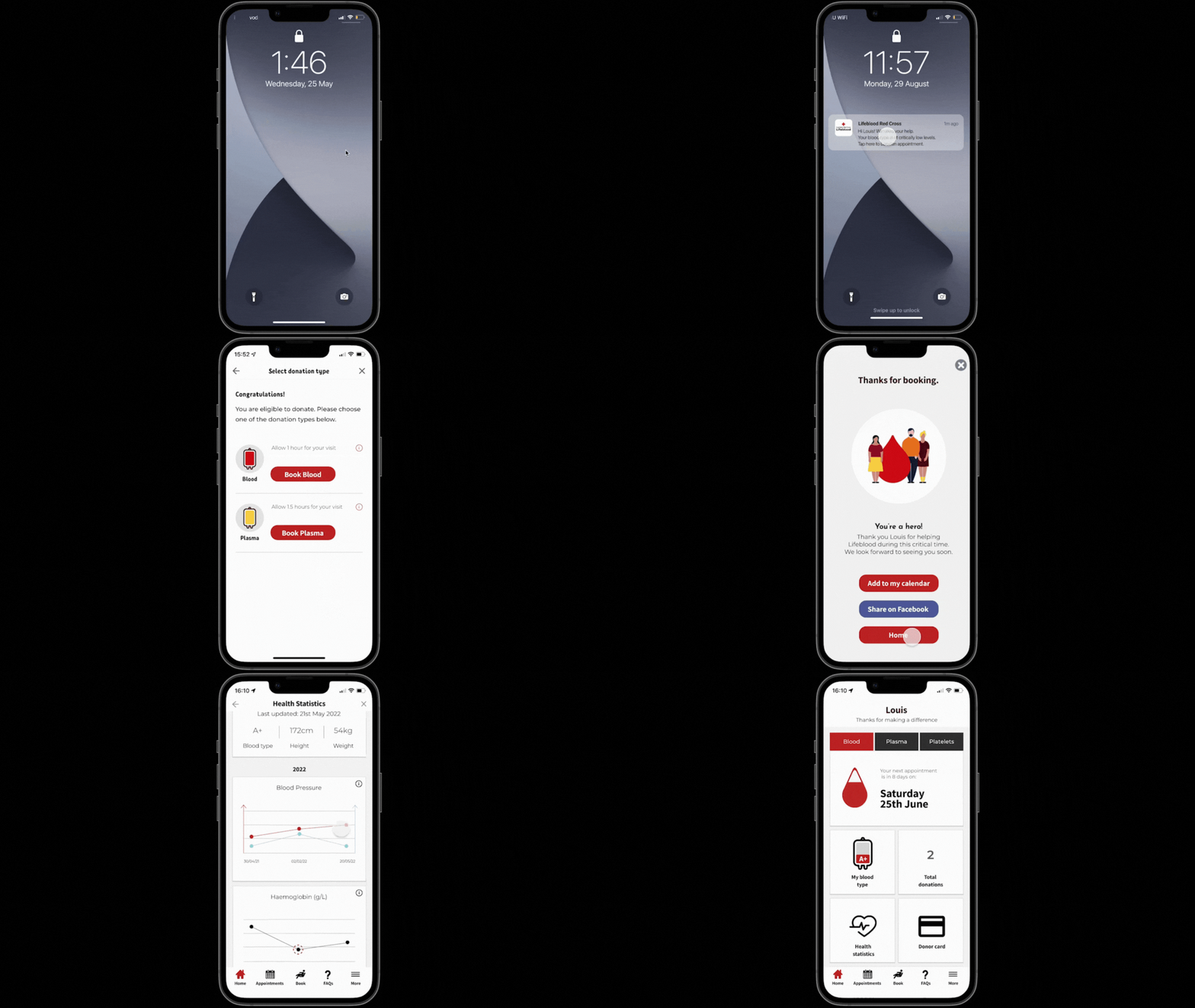
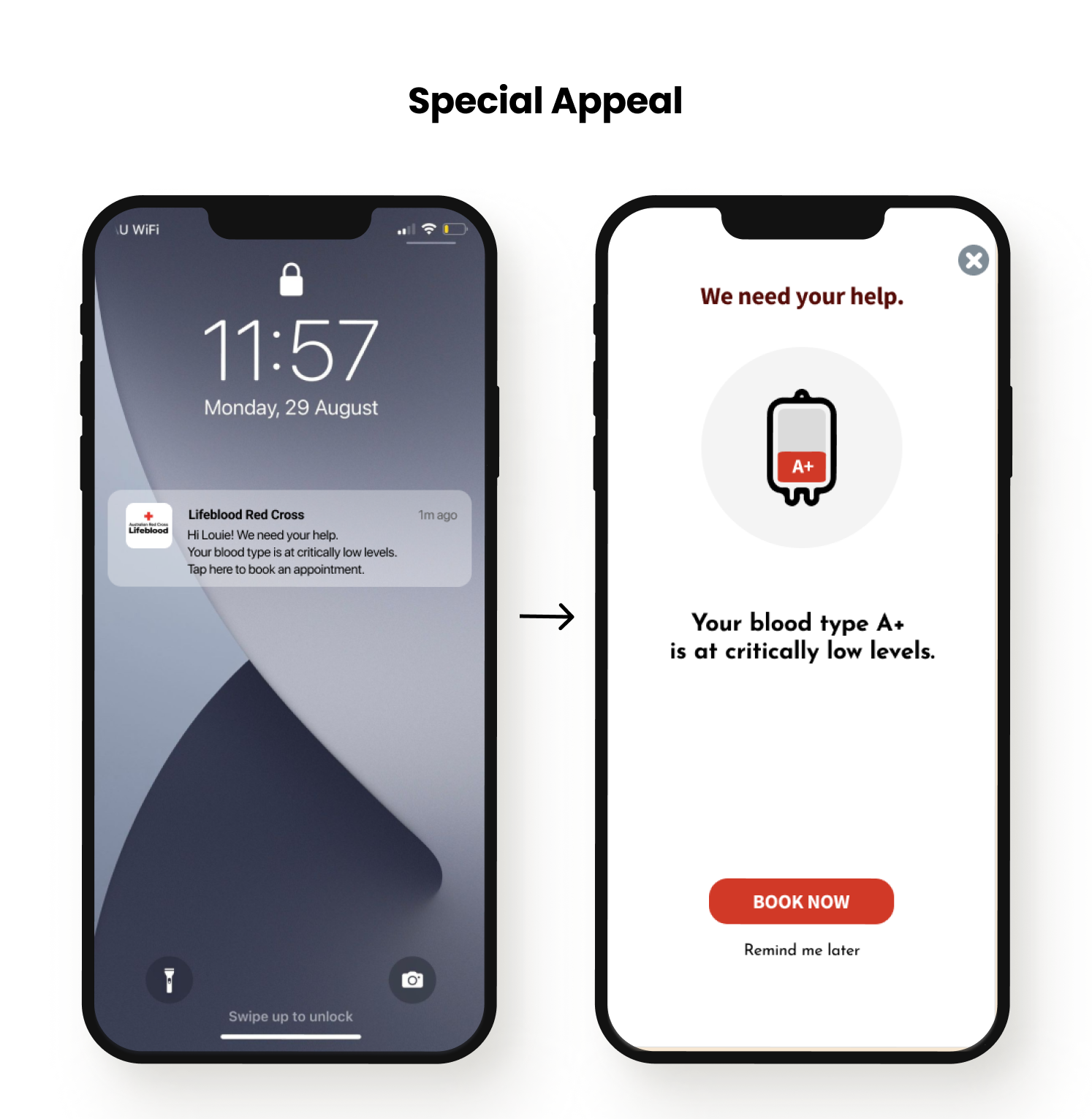
App notifications designed to nudge the donor into action and complement Lifeblood’s phone outreach to donors.
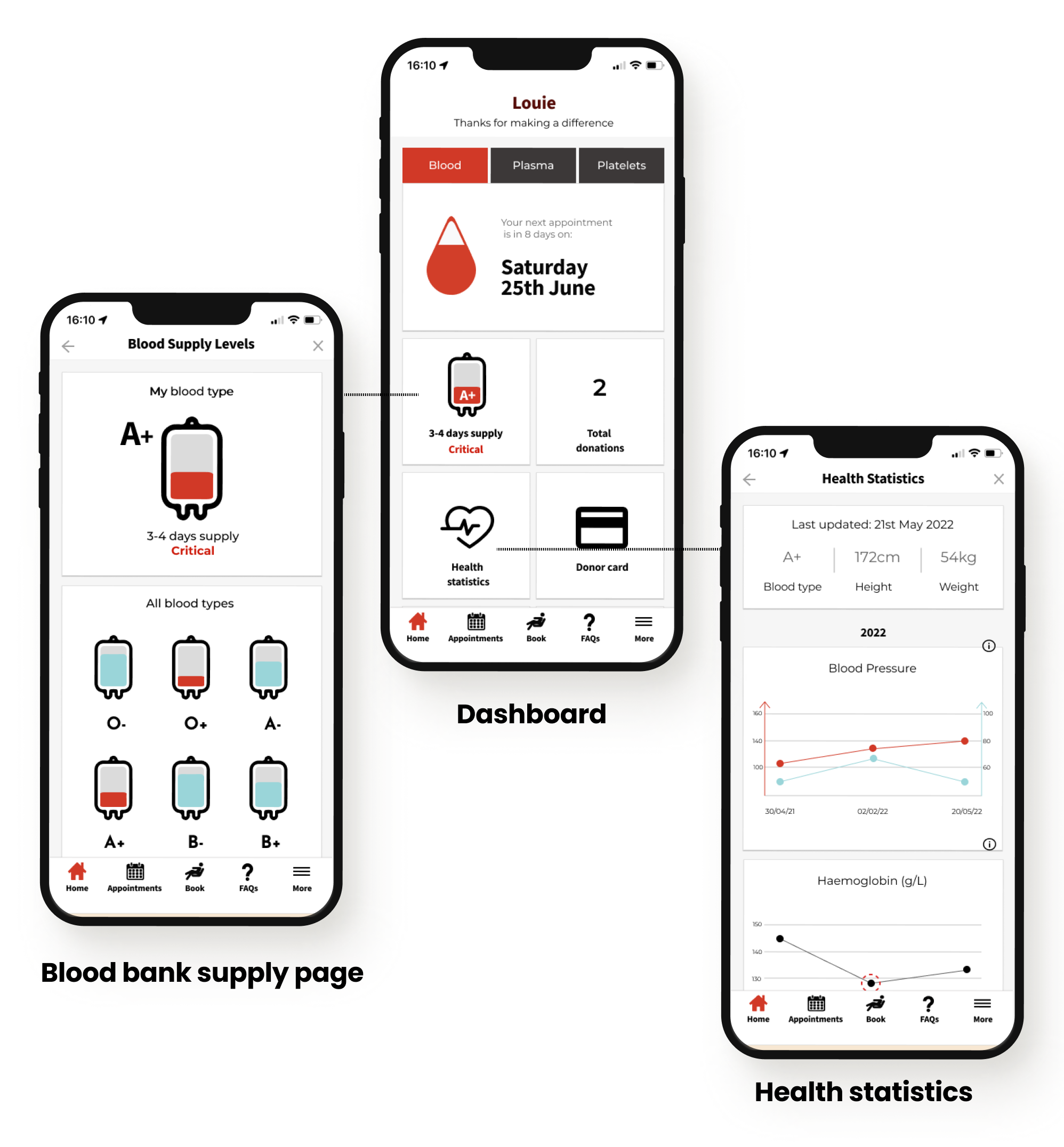
A dashboard redesign to improve user engagement with the app, introducing a new feature that displays the supply level of the donor’s blood type in the bank.
THE RESULT
Our users who were irregular donors validated the app notifications and said they would be effective reminders. They also validated the redesigned dashboard, expressing delight at the blood supply level and the existing health statistics features that we placed on the dashboard.
NEXT STEPS
A holistic UX strategy that integrates marketing, education and non-financial incentives on digital and non-digital platforms. A meaningful shift in voluntary behaviour would require a multi-pronged strategic campaign across all demographics to educate and instill a fundamental sense of one’s civic duty to give blood.
PROJECT ROLES AND RESOURCES
Team
3
Timeline
2-week sprint
Roles
Research, UX/UI design, copywriting, prototyping, usability testing
Tools
Figma, Miro, Marvel
RESEARCH KICKOFF
ANALYSING THE CURRENT EXPERIENCE
To form a baseline on Lifeblood’s current digital experience, we conducted a usability test with five participants.
Our high-level goals were to understand if there were any pain points with the appointment booking process and to observe how people used the app and website generally.
What we learned
Test results corroborated our view that Lifeblood’s website had an emphasis on good UX design and there were no fundamental pain points that would deter users from making appointments.
The App
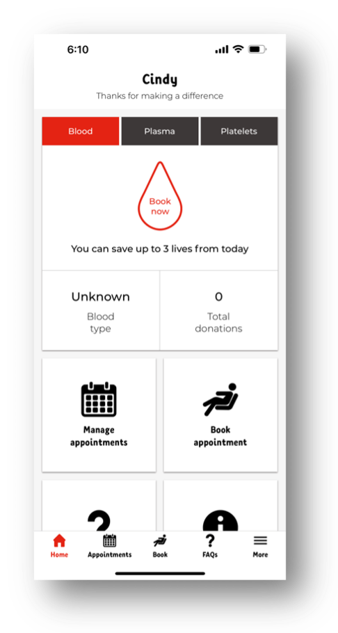
Some minor issues with checking availability at different donation centres but as a whole, users found the booking process to be a good experience.
Lifeblood’s current app: Landing dashboard
The Website
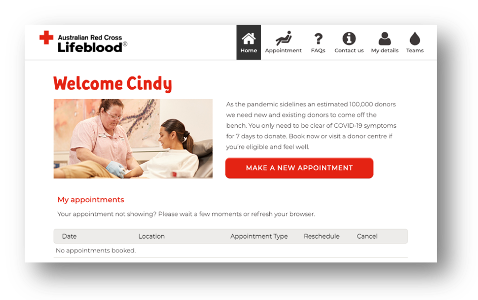
Similarly, Lifeblood’s website was well-designed with a straightforward booking process.
Users felt that overall, it was a seamless experience.
Lifeblood’s current website: Donor profile landing page
“Test results corroborated our view that Lifeblood’s website had an emphasis on good UX design and there were no fundamental pain points that would deter users from making appointments.”
INSIGHTS FROM THE GROUND
With our user research, some of the high-level questions we set out to ask were:
What motivated donors to donate?
What were their experiences like with giving blood?
What did non-donors think about blood donations?
What were their pain points?
Why did people who had previously donated stopped returning?
Anna (right) from the team donating plasma with her friend Biyu.
MINING THE DATA
Armed with notes from 35 interviews (25 guerilla + 10 user interviews), we had more than 600 individual insights.
As a team, we were indefatigable in mapping these insights so we could unearth what the broader affinities were.
This helped make sense of the large amount of information, revealing common themes, goal and pain points of our users.
Our affinity mapping exercise
THREE DONOR TYPES
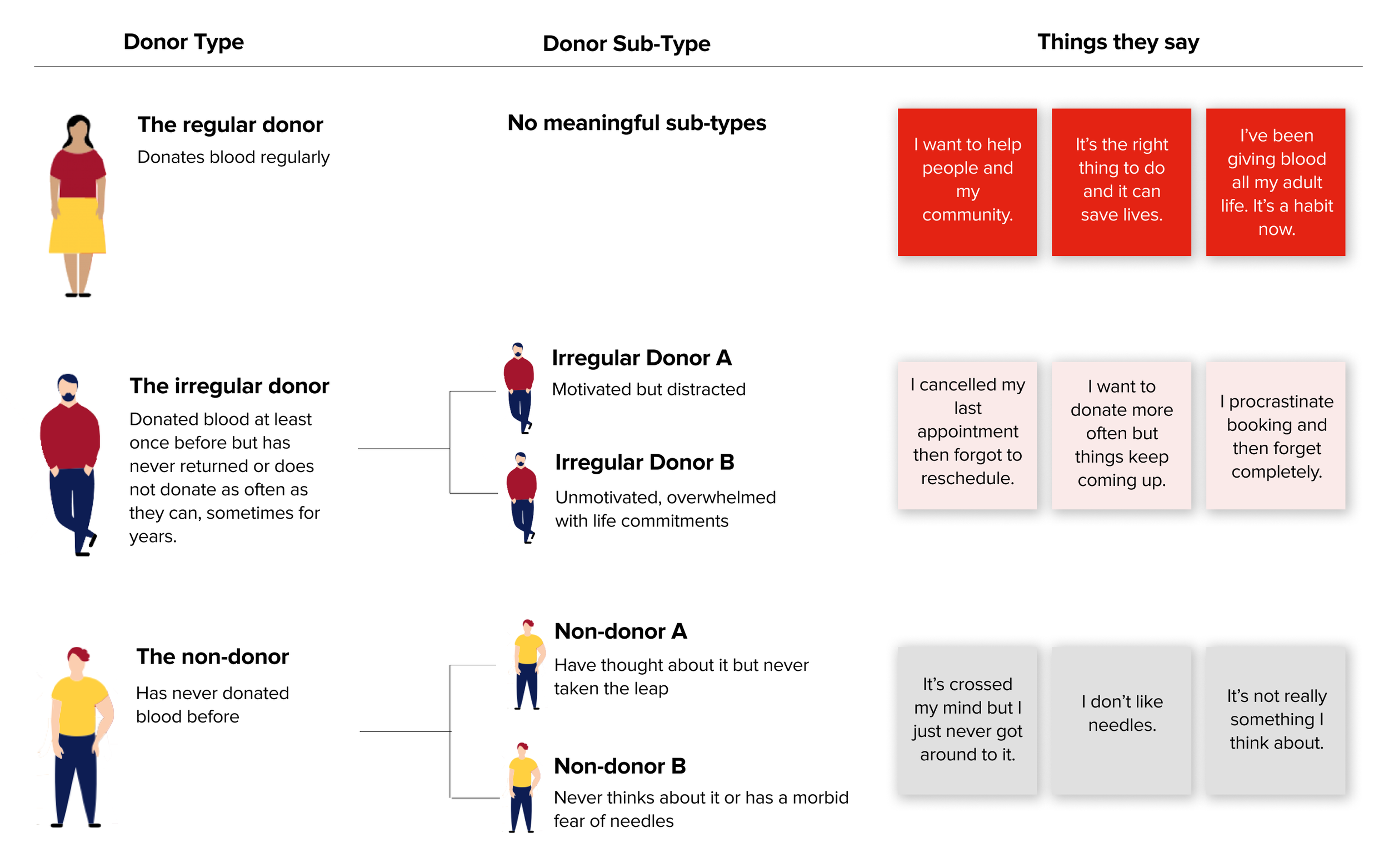
It became apparent from our user research that every one of us inevitably falls into one of three main types of blood donors – a regular donor, an irregular donor, or a non-donor.
We identified the common insights that gave us a deeper understanding of the motivations and behaviours of each donor type.
KEY DISCOVERIES
#1. A matter of habit
For many regular donors, donating blood was a matter of habit. Lifeblood staff know this and take steps in providing a pleasant experience to encourage donors to come back. But the journey is long - it takes about 10 donations before it starts becoming habitual. Meanwhile, 43% of first-time donors don’t come back.
#2. For some, they simply forget
Irregular donors were generally people who intended to donate more often, but were plagued with common challenges:
not able to find the time;
not rescheduling after cancelling;
procrastination
#3. People cancel. a lot.
People frequently cancel their appointments. This was exacerbated by COVID-19 during which, according to Lifeblood statistics, 1 in 5 people cancelled. Often, they forget to reschedule and do not go back.
#4. Lifeblood calls you
Lifeblood has a phone outreach program where staff calls donors when they are eligible to donate again or when the blood bank has critically low levels of their blood type.
SOLVING FOR THE RIGHT DONOR
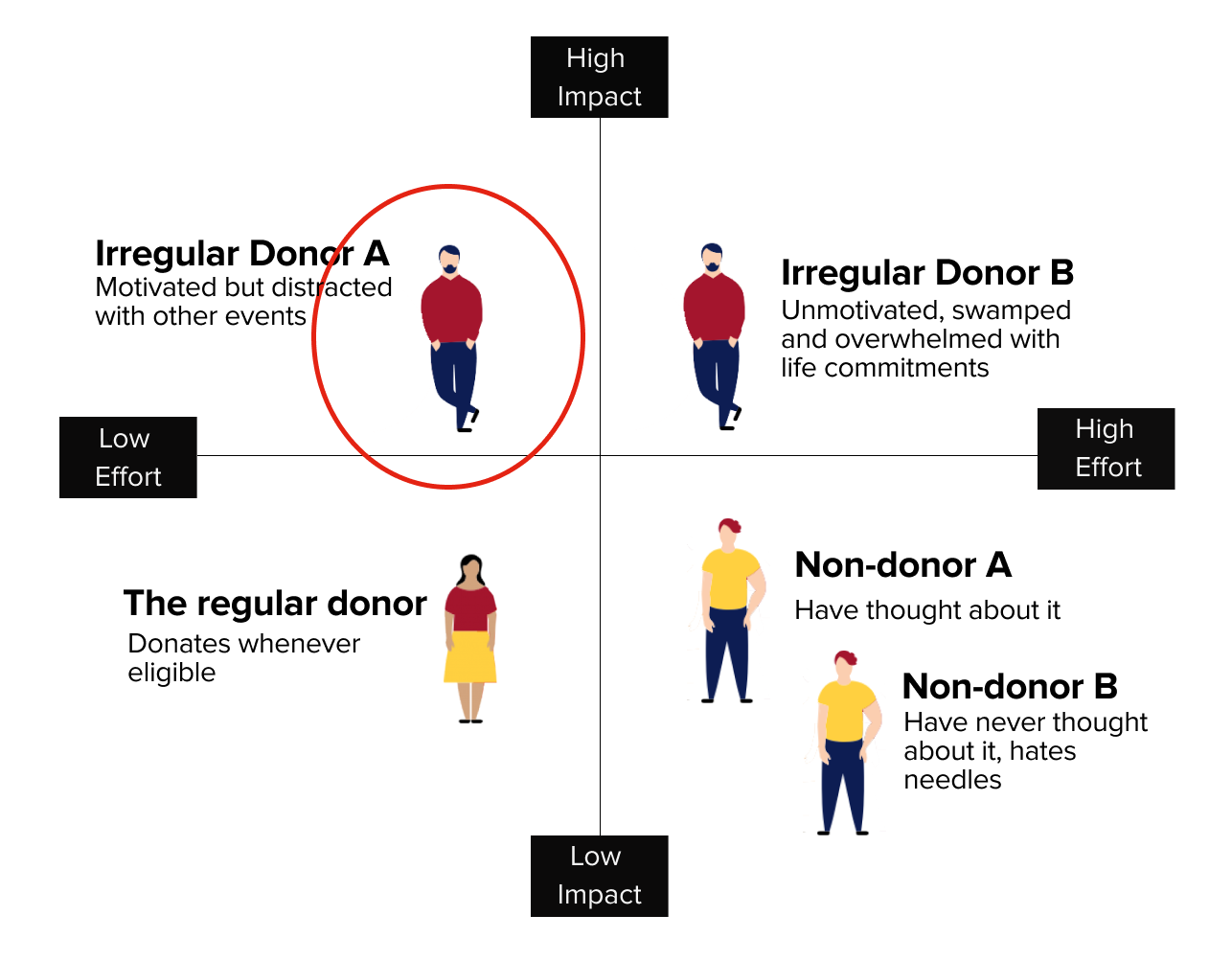
Having defined high-level donor types, each characterised by distinct behaviours and needs, we needed to identify our target donor so we could find the right problem to solve.
Through an impact-effort matrix evaluation, it was clear that the motivated but distracted irregular donor would be easiest to target when it comes to encouraging more blood donations.
An effort-impact matrix revealed a clear candidate for our problem-solving
The Motivated Irregular Donor
Donates when convenient
Often cancels appointments then forgets to reschedule
Will act on phone appeals from Lifeblood
The motivated irregular donor is distracted and forgetful but has the potential to be nudged in the right direction.
Behaviours
Needs and Goals
Wants to donate more regularly to help people
Wants reminders so they can be better at booking donations more frequently
Wants to know when their blood type is critically needed
FRAMING THE PROBLEM
A WAY TO PROMPT SCHEDULING APPOINTMENTS BECAUSE DONORS OFTEN FORGET
Our research showed us that the biggest barrier preventing motivated donors from donating blood regularly is tragically simple:
Something comes up, so they cancel a donation appointment but gets distracted and forgets to re-schedule.
Which begs the question:
How might we prompt donors to book blood donation appointments?
DESIGN KICKOFF
THE DESIGN PROCESS
Three primary questions informed our design solution:
How do we inspire donors who intrinsically want to donate, but are non-committal and often forgets to rebook a donation?
How could we incentivise donors without only relying on their goodwill?
What contexts need to be considered?
We drew insights and inspirations from research into local blood donation statistics and blood bank websites from other countries.
A blood inventory feature
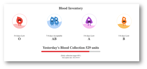
We surveyed other countries’ blood banks for ideas. The most interesting was a blood inventory feature on Hong Kong’s Red Cross Blood Transfusion website. We designed and tested a similar feature, which was received well by our users.
Hong Kong Red Cross Blood Transfusion featured a blood inventory infographic on their website homepage
Repeat donors are the right target
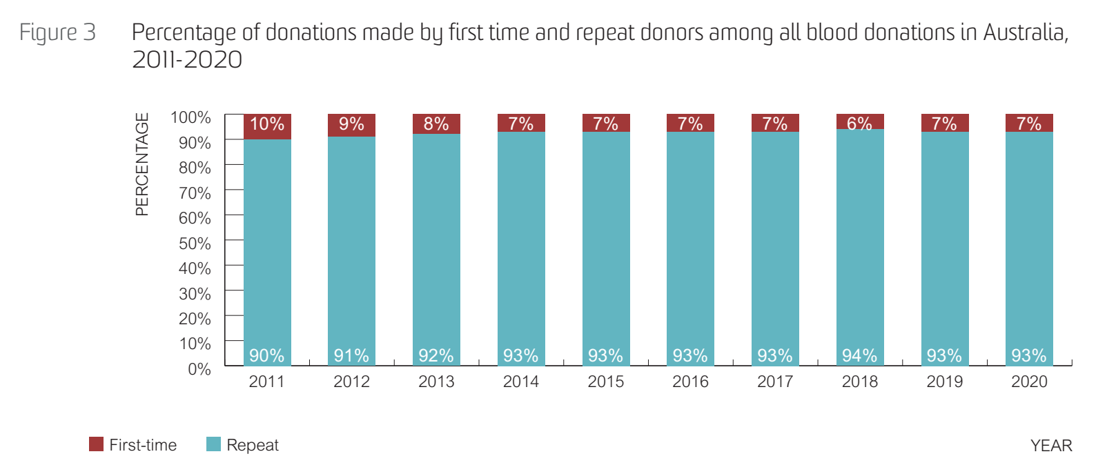
While researching Australian blood donation statistics, we discovered that repeat donors contributed to >90% of Lifeblood’s blood donations over the last ten years. This told us that first-time donors are much harder to access, corroborating the insights from our user interviews, and that our solution should focus on increasing donations from repeat donors.
Repeat donors make up >90% of all blood donations in Australia
Source: Transfusion-transmissible Infections in Australia 2021 Surveillance Report
INTRODUCING
APP NOTIFICATIONS AND NEW DASHBOARD FEATURES
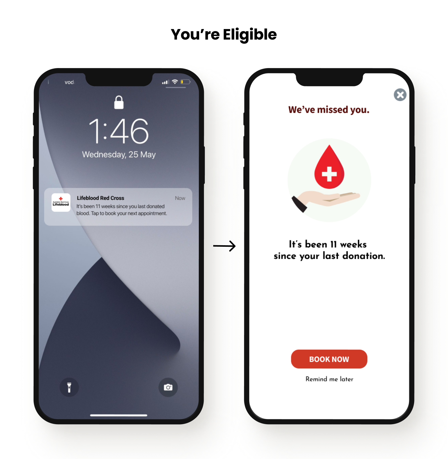
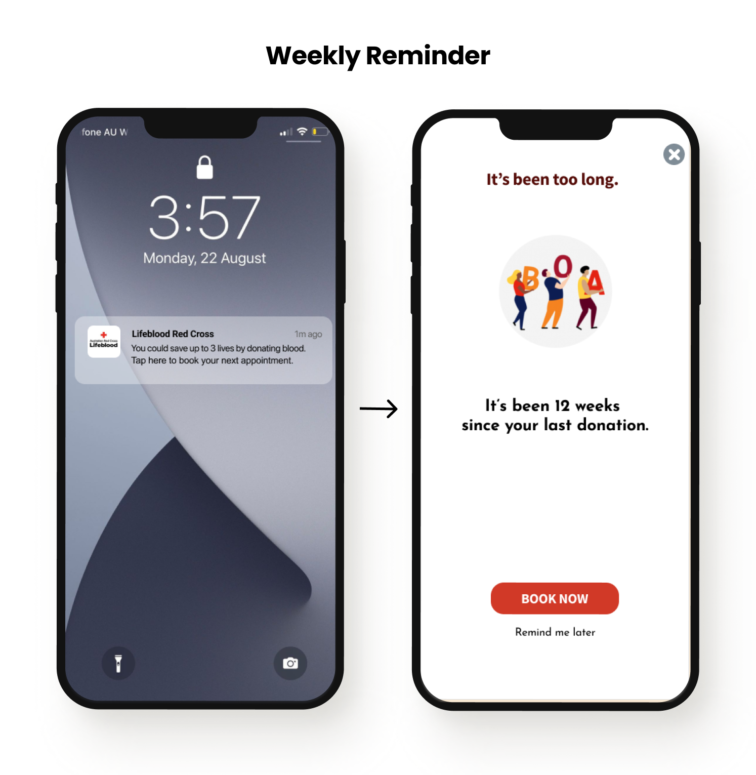
Our reminders aim to nudge intrinsically motivated donors towards a blood donation. And for the rare occasion when Lifeblood really needs their blood type, they’ll send an appeal notification for help.
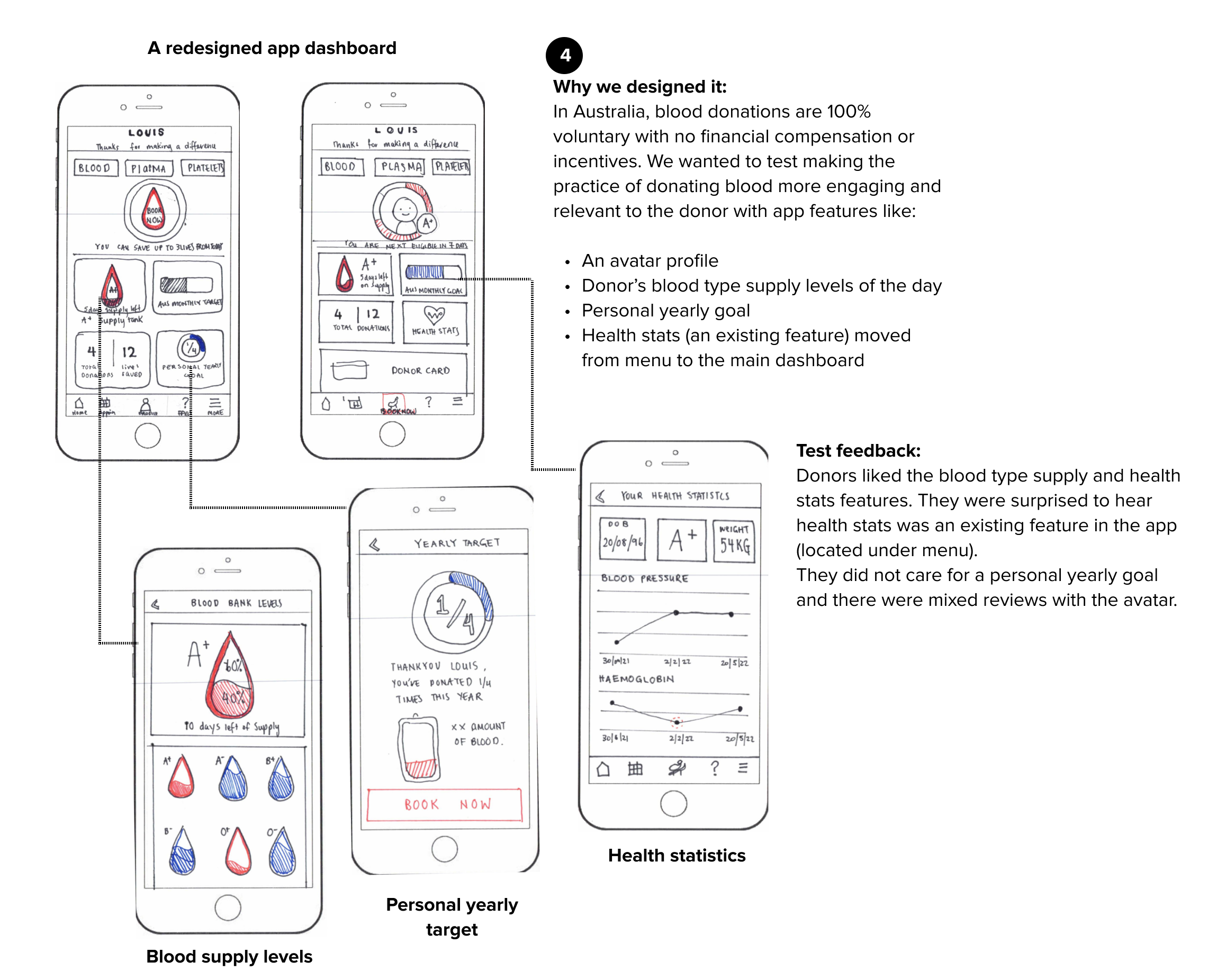
We designed a new blood supply inventory feature and placed the existing donor’s health statistics feature on the app dashboard - aimed at improving user engagement levels with the app.
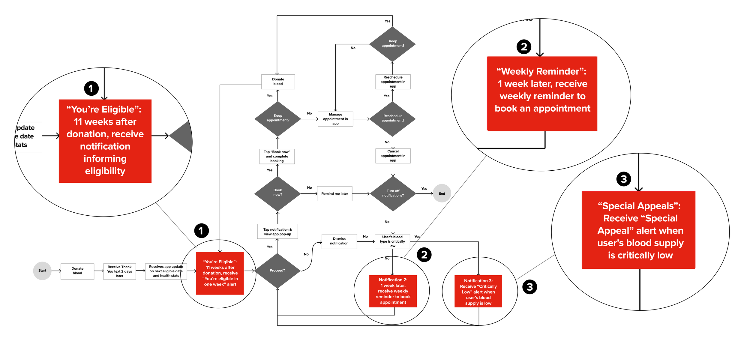
Notifications in the User Flow
Our proposed notifications were designed to nudge the donor at various points of the user flow into ultimately making a blood donation.
A SPEEDY PROTOTYPE
We needed to know if we were on the right track, so we tested a low-fi prototype with 5 participants.
Notifications
These notifications needed to compel action, so the messaging had to hit home and be perceived as helpful reminders without tipping over to pesky or annoying.
Relevant and Engaging Features
While the app did not need a complete redesign, we tested some new features inspired by our research to see if they might resonate with users and improve engagement levels.
HOME STRETCH
REFINING THE PROTOTYPE
Using feedback from our paper prototype to iterate our final prototype.
NOTIFICATIONS
DASHBOARD WITH NEW FEATURES
Final Prototype GIF
CONCLUSION
In a two-week sprint, we created a conceptual solution that was easy to implement and designed to nudge donors into taking action.
Success Metrics
One way to measure effectiveness is to evaluate an increase in donations from donors that had arrived at the app’s booking page via the notification pop-up.
The power of the notifications lie in their potential to build long-term behavioural changes. With greater consistency in scheduling appointments, conversions to blood donations should increase - encouraging the makings of a habit. Over time, these irregular donors could someday turn into full-fledged regular donors.
REFLECTIONS
Test quickly and often
One can never be too certain of an idea’s product-market fit, even if it is backed by early research. With only 2 weeks for the project, one of our most crucial decisions that helped us deliver a viable solution was testing our ideas early through simple prototypes.
The best solutions aren’t always the fanciest
We initially worried that our notifications solution would not be sophisticated enough. But we contended with the fact that Lifeblood’s digital experience was already great and marketing initiatives were out of scope. Importantly, it was clear from our tests that our solution, while simple, would be effective.
There are times when people simply need better ways of doing things - they don’t have to be new or fancy.
What could we have done with more time?
With sufficient time and resources, we could build out a holistic UX strategy that integrates marketing, education and non-financial incentives across both digital and non-digital platforms, partnering with schools, hospitals, corporate employers and social media.
Currently, 1 in 30 Australians give blood each year to serve the needs of 1 in 3 people. A meaningful change in these statistics would require a multi-pronged strategic campaign across all demographics to educate and instill a fundamental sense of one’s civic duty to give blood.
Thanks for taking the time to scroll to the bottom.
If you want to know more about me or my design process, get in touch!

